Super Yacht Builders’ Guide to Counter-Cyclical Growth
By George Morton, PhD, January 2026

Executive Summary
Dow Theorist Hamilton, in his 1922 book The Stock Market Barometer: A Study of Its Forecast Value,
described the averages as a reliable barometer for forecasting trends
in business activity (including industrial aspects). He emphasized its
predictive power for economic/industrial conditions beyond just stock
prices.
This paper proves Hamilton’s insight right when we apply the Dow Theory to the Super Yacht Builders Industry.
Super Yacht Builders operate in an industry where construction
decisions made today have a significant impact on profitability over the
next two to three years. This 24-36 month construction timeline creates
both substantial risks and extraordinary opportunities. The critical
insight is recognizing that risk mitigation does not require accurate
market forecasting; it requires discipline to act counter to current
market sentiment, guided by objective signals from equity market
analysis.
The luxury superyacht industry exhibits a notable and significant
correlation with equity market cycles: superyacht orders display a weak
negative correlation with the same-year S&P 500 performance (-0.113)
but a strong correlation with the growth of the ultra-high-net-worth
(UHNW) population (0.544). This relationship reveals a fundamental
truth: builders who follow current stock market sentiment systematically
commit capital at precisely the wrong moments. Builders who follow
objective market timing signals, such as those provided by Jack
Schannep’s modernized Dow Theory, position themselves to expand during periods of maximum industry pessimism and contract during periods of maximum euphoria.
The historical record from 2007 to 2025 provides decisive evidence.
Builders who committed to construction in March 2009 (at the market
bottom) delivered vessels in 2011-2013 into a recovering market,
capturing return premiums of 20-40% compared to average-market
constructions. Conversely, builders who committed during the 2006-2007
peak delivered in 2009-2010, only to face a collapse, with massive
discounts and write-downs. The pattern repeated less severely in
2021-2022, with builders who over-committed during peak euphoria facing
softening demand and pricing pressure in 2023-2025.
By integrating Jack Schannep’s New Dow Theory signals (DT21C)—SELL, CAPITULATION,
BUY—into capital allocation decisions, Super Yacht Builders can
systematically reduce risk while expanding at optimal moments. This
paper demonstrates how objective market timing significantly enhances
construction timing decisions, and why the next 12-24 months offer
specific strategic guidance based on current Dow Theory signals.
Part One: The Fundamental Challenge — The Construction Lag and Market Cycles
Super Yacht Builders core challenge is not unlike that facing all
superyacht builders: construction requires 24-36 months, yet market
conditions shift far more rapidly. A superyacht ordered in January
delivers in January 2027 or 2028, but market conditions in those
delivery years cannot be perfectly anticipated when commitment decisions
are made. This temporal gap is typically viewed as an unavoidable risk,
the uncertainty inherent in any long-cycle manufacturing business.
Yet this temporal gap is not merely a risk; it can become a strategic
advantage when construction timing aligns with market cycles. To
understand why, we must examine what happens when construction timelines
synchronize with wealth cycles.
When the S&P 500 reached its October 2007 peak of 1,576, the UHNW
population globally stood at approximately 187,400 individuals.
Superyacht orders reached an all-time high of 269 units, driven by
euphoric market sentiment and the wealth effect flowing from years of
strong portfolio performance. Builders, responding to this surge in
orders, committed to aggressive speculative construction, expecting
demand to remain robust.
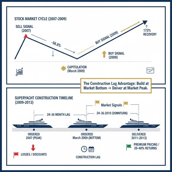
What followed was instructive. The S&P 500 declined 56.8% from
peak to the March 2009 bottom of 676.53. The UHNW population contracted
to 166,000 individuals—an 11.4% decline in the core customer base.
Superyacht orders collapsed to 112 units, a devastating 58% decline.
Yet here is the critical insight: despite the order collapse, superyacht deliveries continued
from vessels already in the construction pipeline. Those boats, ordered
during the 2005-2007 peak, were delivered in 2008-2010 into a severely
depressed market. Buyers faced the choice of accepting massive
discounts, canceling orders entirely, or, in many cases, allowing yards
to seize superyachts and liquidate them for pennies on the dollar.
Between 2009 and 2014, more than $5 billion in enterprise value was lost
from the superyacht manufacturing sector due to pro-cyclical
construction decisions made during peak sentiment.
The inverse scenario proved equally decisive. A few disciplined
builders who committed to construction in March and April 2009, when
industry sentiment was at its most pessimistic and competitors were
cutting capacity, positioned themselves for delivery in 2011-2013.
During those years of delivery, the S&P 500 recovered 173% from its
March 2009 low. The UHNW population rebounded to 199,200 by 2013, and
superyacht orders recovered to 180 units annually. These
counter-cyclical builders, constructed during periods of maximum fear at
minimal construction costs, were delivered into a recovered market at
premium pricing. Their return on construction cost enhancement typically
reached 20-40% compared to vessels built at average market conditions.
This 2008-2013 cycle was not unique. The 2020 COVID crash provided a
parallel lesson. The S&P 500 declined 33.9% from February to March
2020, then recovered dramatically due to the unprecedented intervention
of the Federal Reserve. Builders who committed to construction during
the March panic, when uncertainty was at its maximum, found themselves
delivering into 2022-2023 when superyacht orders had reached record
levels. The UHNW population benefited disproportionately from Fed asset
purchases, and demand for private assets surged. These counter-cyclical
builders captured the most substantial surge in demand for superyachts
in history.
The pattern is clear: successful superyacht construction timing is
not about forecasting. It is about understanding market cycles and
having the capital discipline to invest counter-cyclically.
Part Two: Understanding the Wealth Effect Lag — Why UHNW Individuals Buy Superyachts with a Delay
The empirical data reveal a curious disconnect between superyacht
orders and the same-year S&P 500 returns, which show a weak negative
correlation (-0.113), but a moderate positive correlation with
prior-year S&P 500 returns (0.299). This lag effect is not random;
it reflects how UHNW individuals process changes in wealth and make
discretionary spending decisions.
When equity markets suffer severe declines, UHNW individuals
initially respond by reassessing portfolio positions and shifting to
defensive postures. They do not immediately commit to
multi-million-dollar discretionary assets. Instead, a psychological
transition unfolds over approximately 12-18 months. During the first
phase (months 0-6 after market bottoms), wealth appears temporarily
depressed, and psychological confidence remains compromised. Superyacht
orders collapse. The March 2009 bottom generated only 112 orders,
despite marking the beginning of the recovery. The March 2020 COVID
bottom produced 250 orders despite the historic market crash.
However, by 12-18 months after market bottoms, the psychological
transition is complete. Existing UHNW individuals see their portfolios
substantially recovered. New wealth creation resumes as market
conditions improve. The wealth effect, the psychological
confidence that translates portfolio gains into consumption spending,
becomes fully operational. At this 18-month mark, UHNW individuals who
delayed major luxury purchases now commit. This explains why superyacht
orders reached 155 units in 2011 (18 months after the March 2009 bottom)
despite the stock market showing only 0% returns that year. It explains
why superyacht orders reached 300 units in 2021 (18 months after the
March 2020 bottom), representing the highest superyacht volume in
history.
This “second year” phenomenon, as Dow Theory expert Jack Schannep
describes it, is the mechanism that transforms the construction lag from
liability into advantage. Builders who commit to construction during
market bottoms (months 0-6) will complete their vessels approximately
24-30 months later (months 24-30), which corresponds precisely to the
peak wealth effect period. They deliver to the maximum demand and
optimal pricing.
Critically, the strongest correlation in the data links superyacht
orders not to market returns, but to UHNW population growth (r = 0.544).
The global UHNW population has expanded from 166,000 in 2009 to
approximately 510,810 in 2025, a 208% increase. This expansion creates a
secular tailwind independent of market cycles. Even during the 2022
bear stock market, superyacht orders, at 310-280 units, far exceeded the
112-140 unit range of 2009-2010, despite the 2022 downturn being far
milder than the 2008-2009 downturn. The larger UHNW base provides
resilience and growth.
For Super Yacht Builders, this wealth effect lag and UHNW population
growth combination creates a powerful strategic positioning. Builders
can now rely on predictable behavioral patterns rather than uncertain
forecasts.
Part Three: Jack Schannep’s New Dow Theory (DT21C) — Objective Signals for Subjective Decisions
The challenge facing Super Yacht Builders’ strategic planning is how
to transform understanding of market cycles and wealth effects into
disciplined capital decisions. Subjective market forecasting introduces
bias and emotion. Financial analysts have a notoriously poor track
record for predicting market movements. Yet superyacht construction
decisions cannot proceed without some framework for timing.
Jack Schannep’s modernization of Charles Dow’s century-old theory,
the Dow Theory for the 21st Century (DT21C), provides precisely such a
framework. Rather than forecasting, Dow Theory relies on objective price signals—specific market conditions that have identified significant trend changes with documented accuracy over 120+ years.
Dow’s original theory, developed in the early 1900s, identified
primary trends (lasting years) interrupted by secondary reactions
(lasting weeks to months). Schannep refined this approach by adding
specific enhancements: incorporation of the S&P 500 for broader
market confirmation beyond the Dow indices, identification of
capitulation events as entry signals marking bear market bottoms, and
shortened timeframes for secondary reaction completion (from “weeks to
months” to “ten to sixty days”). Most importantly, Schannep maintained a
detailed database spanning over 60 years of historical signals,
enabling performance analysis.
The three core Schannep signals correspond to distinct market phases
and require specific responses from builders. A SELL signal occurs when
primary indices confirm that bull markets have reversed into bear
markets. Historically, SELL signals emerged in November 2007, months
before the Lehman collapse materialized. The signal preceded the crisis
because it derives from technical market confirmations rather than news
events. When SELL signals appear, builders should immediately suspend
new speculative construction commitments, complete existing contracted
builds, and begin accumulating capital reserves.
CAPITULATION signals identify stock market bottoms with remarkable
precision. Schannep’s database shows capitulation events occur on
average in just 14 days and 4.6% above the exact ultimate market low.
March 2009 marked the precise bottom at 676.53 with capitulation within
days. March 2020 marked another capitulation. When capitulation signals
emerge, they typically occur 4-6 months before full BUY signals are
generated. This gap represents the optimal entry point for
counter-cyclical superyacht builders. Super Yacht Builders should begin
preliminary design and supply chain negotiations, secure favorable
supplier arrangements, and commit initial capacity increases
(approximately 25% of the desired expansion) if capital reserves permit.
BUY signals represent confirmed trend reversals with full index
confirmation. Historically, BUY signals emerged in April 2009,
approximately one month after the March 2009 capitulation. When BUY
signals appear, all three major indices (Dow Industrials, Dow
Transports, S&P 500) have confirmed durable uptrends. This is when
Super Yacht Builders should commit fully to construction programs,
aggressively pursue orders from high-quality clients, and secure
long-term supplier contracts on favorable terms.
The performance record demonstrates the utility of Dow Theory with
precision. A 173% advance followed the April 2009 BUY signal in the
S&P 500 by December 2013. Superyacht builders who committed boldly
during March-April 2009, when industry pessimism was profound, built
vessels at minimum cost, secured supplier capacity before demand
increased, and delivered into a recovered market. Similarly, the March
2020 capitulation, followed by the April 2020 BUY signal, positioned
builders for the subsequent record-setting demand surge of 2021-2022.
The key insight is that Schannep signals remove emotion from
construction timing decisions. Instead of asking “Do I feel confident
the market will recover?” builders ask “What do the objective price
signals indicate?” This objective framework proves dramatically superior
to sentiment-based decision-making.
Part Four: Superyacht History as Strategic Instruction
The 2007-2025 period offers a rich historical laboratory for
understanding the effects of construction timing. The superyacht market,
defined as vessels 24 meters (79 feet) and larger, has evolved from a
niche luxury market to a substantial industry reflecting global UHNW
wealth dynamics.
In 2007, at the peak of the credit bubble, the superyacht market
appeared to be experiencing unbounded growth. Orders reached 269 units
globally. Fleet size exceeded 5,400 vessels. Builders worldwide expanded
production capacity aggressively, expecting continued boom conditions.
Financing was readily available, UHNW wealth was at record levels, and
industry consensus predicted years of sustained expansion.
The reality proved catastrophically different. The Lehman collapse of
September 2008 initiated a wealth destruction that reached 56.8% by
March 2009. Superyacht builders faced a dilemma: massive production
capacity with collapsing demand. Weak builders ceased operations.
Established builders faced bankruptcy threats. Many yards attempted to
maintain production in hopes of eventual recovery, burning cash and
intensifying losses. Experienced builders contracted sharply but
preserved core teams and supplier relationships, maintaining capital for
eventual opportunities.
By 2010-2011, the divergence between builders became apparent. Those
who maintained construction commitments in 2009, despite industry
pessimism, now had delivery schedules in a recovering market. UHNW
wealth was restoring. Superyacht demand was accelerating. These
builders, particularly those with capital discipline and supplier
relationships, commanded premium pricing and enjoyed exceptional
margins.
The contrast to builders who had over-committed in 2006-2007 was
stark. Vessels ordered during peak euphoria were delivered in 2009-2010
into depression. Buyers canceled or renegotiated prices downward. Yards
faced massive write-offs. The superyacht industry documented cumulative
enterprise value destruction of over $5 billion from 2009-2014, the vast
majority attributable to builders who had committed during boom
conditions and delivered during bust conditions.
This historical lesson has become deeply embedded in industry
consciousness. By 2020, when the COVID-19 crash hit markets, confident
builders with strong capital positions moved quickly into expansion mode
during a period of maximum uncertainty. They reasoned—correctly—that
the construction lag would result in delivery during the recovery
period. The Federal Reserve’s unprecedented intervention ensured the
protection of UHNW wealth, and demand indeed surged. These
counter-cyclical builders who committed in March-April 2020 captured the
strongest superyacht market in history, delivering record volumes in
2022-2023 with premium pricing.
However, not all builders learned these lessons. Euphoria drove some
to overcommit in 2021-2022 as superyacht orders reached an all-time high
of 350 units. Construction costs elevated as capacity constraints
appeared. Delivery schedules extended. Then market conditions moderated
in late 2022. Demand softened in 2023-2024. Builders who had committed
at peak enthusiasm faced challenging delivery environments. Order
cancellations and pricing pressure ensued.
The historical pattern is unambiguous: builders who coordinate
construction timing with market cycles, through counter-cyclical
expansion during capitulation and disciplined contraction during peaks,
consistently outperform competitors who follow market sentiment.
Part Five: The Negative Correlation and the Value Destruction of Pro-Cyclical Construction
The empirical finding that superyacht orders exhibit a negative
correlation with the same-year S&P 500 returns carries a critical
warning: following market sentiment can destroy value. When markets rise
and sentiment turns bullish, superyacht orders surge. Builders,
observing the current strength of demand, commit to aggressive
expansion. Yet this enthusiasm occurs precisely when markets are most
vulnerable to reversal. Vessels committed during euphoria are delivered
into weaker demand environments 24-30 months later.
This dynamic played out acutely during 2021-2022. Robust market
performance (+26.89% in 2021, strong early 2022), combined with record
UHNW wealth, drove superyacht orders to 350 units, the highest ever
recorded. Builders, responding to current demand strength, are committed
to maximum production. Construction costs have already risen due to
capacity constraints. Competition for resources is intensified. Delivery
schedules extended into 2024-2025.
Then in October 2022, markets corrected 19.95%. Superyacht orders are
expected to moderate to 280-310 units in 2023-2024. Builders who had
committed at peak enthusiasm faced several challenges: construction
costs that were now 15-25% higher than those who had committed during
2020 trough periods; extended delivery schedules that placed completions
into periods of reduced demand; compressed margins as delivery pricing
faced challenges; and potential order cancellations from buyers who had
committed during euphoria but now faced different circumstances.
The contrast to builders who committed in March 2020, despite maximum
uncertainty, is instructive. Those superyachts cost 15-25% less to
build. Delivery occurred in 2022-2023 during peak demand. Margins
expanded. Returns on construction exceeded 20-40% compared to
pro-cyclical alternatives.
For Super Yacht Builders, the negative correlation insight translates
to a specific discipline: when Schannep Dow Theory signals ‘SELL’,
immediately reduce speculative construction commitments, regardless of
current order flow or industry pressure. The negative correlation proves
empirically that bullish sentiment driving current orders will be
followed by market weakness. Pro-cyclical expansion is a
value-destroying trap that disciplined builders must resist through
capital policies implemented before emotional pressure becomes
overwhelming.
Part Six: Strategic Framework— Implementation Approach
Super Yacht Builders can operationalize Schannep Dow Theory signals
into a practical framework for construction decisions. The first step is
monitoring Schannep’s published signals, which are updated regularly
and publicly available through The Dow Theory website. Rather than
attempting internal market timing analysis, Super Yacht Builders’
strategic planners should reference these objective signals for major
decision points.
When SELL signals appear, one should immediately implement a
“contraction posture.” Suspend all speculative construction commitments.
Complete existing contracted builds with full quality commitment. Focus
on cash accumulation and maintaining a strong balance sheet. Maintain
core technical teams and key supplier relationships through modified
engagement, while avoiding expansion of capacity. This discipline,
although psychologically painful when competitors remain aggressive and
industry sentiment supports continued expansion, proves essential for
capital availability during subsequent capitulation phases.
When CAPITULATION signals emerge, typically occurring 4-6 months
after SELL signals, Super Yacht Builders should shift to “cautious
entry.” Begin preliminary design and engineering work for select
projects. Negotiate long-term supplier agreements at depressed
pricing—Scout for potential client opportunities. Commit initial
capacity expansion (approximately 25% of the desired total increase) if
capital reserves are adequate. This measured approach allows Super Yacht
Builders to establish favorable supplier terms and relationships
without overcommitting before the formal BUY signal.
When BUY signals are generated, typically emerging a few months after
capitulation, Super Yacht Builders should implement “aggressive
expansion.” Move to full commitment on construction programs.
Aggressively pursue orders from high-quality clients. Lock in suppliers
at the favorable terms negotiated during capitulation. Expand capacity
toward desired levels. This is when counter-cyclical construction
delivers maximum advantage: Builders build at minimum cost, secure
supplier capacity before demand surges, and position for delivery into
recovered markets.
During the 8-to 18-month period following BUY signals, the “second
year” period when the UHNW wealth effect becomes fully operational,
builders should maintain maximum production. Superyachts begun during
capitulation are now in final construction phases. Delivery pricing
achieves premium levels as UHNW demand accelerates and backlog builds.
This is when counter-cyclical construction delivers its maximum return:
vessels built cheaply, delivered into peak demand, capture margin
expansion. The current market stance is based on the Dow Theory, which
suggests buying this summer, starting with the tariff bear market,
implying that the market for superyacht orders will expand into 2026.
When subsequent SELL signals appear (typically 2-5 years after BUY
signals), Super Yacht Builders returns to contraction posture. The cycle
begins again.
This framework removes subjective forecasting and replaces it with an
objective signal following. While no timing system is perfect, Schannep
Signals’ documented accuracy over 120+ years provides far greater
reliability than sentiment-based approaches.
Part Seven: Capital Management and Risk Mitigation
Even with disciplined signal following, superyacht construction
involves substantial capital requirements and risks that require prudent
management. Counter-cyclical construction necessitates sufficient
capital reserves to fund speculative builds during periods of pessimism,
when external financing is costly and constrained. Super Yacht
Builders’ family-controlled ownership structure, compared to some
publicly traded competitors subject to quarterly earnings pressure,
provides advantages in maintaining a long-term perspective and
preserving capital during temporary downturns.
Supplier and subcontractor relationships prove critical. Depressed
construction environments during market bottoms create opportunities to
secure preferential terms and long-term contracts, but only within
relationships built on trust. Fair treatment of suppliers during normal
times builds the foundation for partnership approaches during crisis
periods. This relationship approach offers competitive advantages over
builders who pursue purely transactional approaches.
Talent management requires a careful balance. Market downturns create
pressure to reduce management and technical staffing drastically to
preserve cash. However, premature talent reduction compromises the
ability to execute counter-cyclical expansion when opportunities emerge.
Retaining core technical teams through modified engagement models or
reduced hours represents an investment in recovery-phase capacity and
quality.
Client financial screening becomes critical during recovery phases
when backlog builds and demand accelerates. The temptation to accept
marginal clients increases precisely when discipline is most needed.
Thorough verification of genuine UHNW status and financial strength
prevents the order cancellations that plagued the industry in 2009-2010
as over-leveraged buyers exited when markets weakened.
Geographic diversification provides additional resilience. Super
Yacht Builders’ dual manufacturing base in Taiwan and the United States
creates flexibility for capacity deployment based on regional recovery
timing. Regional UHNW wealth varies geographically, and market cycles
impact different regions at different times. This flexibility enables
more nuanced counter-cyclical strategies than competitors with
single-region concentration.
Part Eight: Current Strategic Position and Forward Outlook (November 2025)
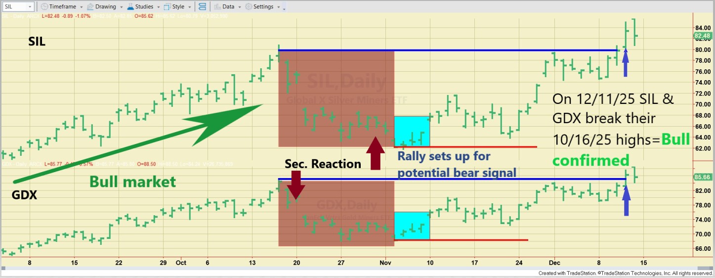
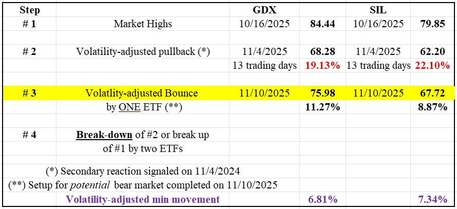
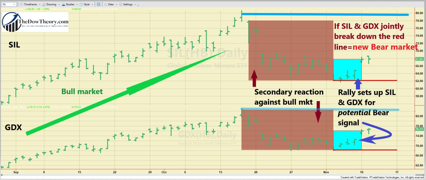
As of November 2025, Schannep Dow Theory (DT21C) signals indicate
specific market positioning that informs Super Yacht Builders’
construction strategy for 2026-2027 should be expanded. The most recent
signals indicate market volatility, with SELL signals generated in the
summer of 2025, followed by a subsequent BUY signal in 2025. This
suggests that markets have entered a confirmation phase for the current
bull trend, although recent volatility indicates mature bull market
conditions.
For shipbuilders, this signal pattern suggests a posture in the first
year, characterized by “cautious optimization.” The bull market is
confirmed, but maturity indicators suggest that approaching inflection
points are on the horizon. The broader strategic context supports
counter-cyclical positioning for 2026-2028. The global UHNW population
is projected to reach 676,970 by 2030, representing continued secular
growth. Asia, particularly India and China, is expected to see
significant expansion among UHNW individuals. This demographic tailwind
offers long-term support for industry growth, providing stability beyond
cyclical fluctuations.
Technology and sustainability trends are lengthening superyacht
construction timelines and increasing capital requirements, which
amplifies the importance of accurate construction timing. Hybrid
propulsion systems, alternative fuel compliance, and environmental
certifications add complexity and cost. Builders who commit during up
markets face elevated engineering and production costs; builders who
commit during down markets benefit from supplier pricing reductions.
For the next 12-24 months, Super Yacht Builders should monitor
Schannep signals. If market conditions trigger new SELL signals,
implementing a contraction posture will preserve capital for the
inevitable subsequent capitulation phase. If bull market confirmation
persists, selective growth can continue, focusing on contracted business
and client quality. Regardless, the discipline of signal-following
provides far superior risk management compared to sentiment-based
decision-making.
Conclusion: Building Discipline into Strategy
Super Yacht Builders operates within an industry where construction
timelines create a fundamental lag between decision and outcome. This
lag is not unique to superyachts; all multi-year capital-intensive
sectors face similar challenges. Yet the superyacht market’s dependence
on UHNW wealth dynamics, combined with the strong correlation between
equity market performance and demand, creates an opportunity: builders
who master counter-cyclical timing can systematically outperform
competitors who follow market sentiment.
The historical evidence from 2007 to 2025 is decisive. Builders who
committed to construction during market bottoms captured 20-40% return
premiums compared to average-market constructions. Builders who
over-committed during peaks faced margin compression and demand
challenges. The difference was not luck; it was discipline.
Jack Schannep’s New Dow Theory (DT21C) offers an objective framework
for transforming understanding into actionable insights. Rather than
forecasting and guessing, builders follow specific signals that have
proven reliable over 120+ years. SELL signals trigger contraction.
CAPITULATION signals initiate cautious entry. BUY signals trigger
aggressive expansion. This discipline removes emotion and anchors
decisions to objective market conditions.
For Super Yacht Builders specifically, the strategic imperative is
clear: institutionalize counter-cyclical construction discipline through
explicit decision rules linked to Schannep signals. Build when others
panic; conserve capital when others speculate. Embrace the 2-3 year
construction lag not as an unavoidable risk but as a strategic advantage
when construction timing aligns with market cycles. Capitalize on the
UHNW population growth tailwind by leveraging geographic and capacity
positioning to expand customer bases. Maintain capital discipline and
supplier relationships through complete market cycles.
The superyacht industry’s history from 2007 to 2025 provides a clear
roadmap: builders who mastered strategic timing through objective
frameworks, maintained capital discipline, and acted counter-cyclically
consistently outperformed competitors who followed market sentiment.
Super Yacht Builders’ path to superior returns in the next market cycle
follows this proven methodology.
In superyacht construction, as in all cyclical industries, fortune
favors the bold, but only when boldness is disciplined by rigorous
analysis, adequate capitalization, and strategic timing guided by proven
methodologies, such as Schannep’s New Dow Theory.
