Saturday, September 20, 2025

Why Today’s Stock Market Valuations Are Not Excessive: Liquidity, Capital Accumulation, and the Repricing of Risk

How liquidity and rising wealth explain today’s high valuations in the stock market


Introduction

Many market commentators warn that stock valuations are dangerously high, pointing to elevated price-to-earnings (P/E) ratios and market cap-to-GDP levels as evidence of a bubble. These warnings often rely on outdated benchmarks. What was considered expensive fifty years ago isn’t necessarily expensive today.

Two structural forces have redefined what counts as “normal” valuations. Today’s levels are not irrational but the natural outcome of two powerful trends:

  1. The persistent expansion of global liquidity.
  2. Raising capital stock per person has pushed down the natural rate of interest.

Together, these forces have changed the equilibrium level of valuations. A Price-to-Earnings ratio of 20 was considered expensive 50 years ago, but now it can be a good value.

Liquidity growth doesn’t just provide more money to invest; it fundamentally alters risk perception, reduces systemic risk fears, and creates a “risk-on” environment in which investors are willing to pay more for future earnings.

Furthermore, a nearly continuously growing stock of capital per person has reduced discount rates, which further encourages higher valuation multiples.

Misconceptions About Liquidity and Valuations

Many analysts argue that liquidity is “neutral” for valuations. Their reasoning typically takes two forms:

Liquidity simply inflates earnings. When liquidity increases, prices, sales, and company earnings grow accordingly. Based on this reasoning, valuation metrics like the P/E ratio should remain unchanged because higher stock prices only indicate higher earnings. Therefore, liquidity would affect the “E” in the P/E ratio, but not the “P.”

Stock market capitalization-to-GDP ratios can’t increase because liquidity inflates GDP. Critics also point to market capitalization versus GDP, arguing that liquidity affects both equally. If GDP is higher due to inflation caused by abundant liquidity, they contend that the market cap-to-GDP ratio should stay stable since both the numerator (market cap) and the denominator are influenced by liquidity.

While intuitive, these arguments miss a crucial point: liquidity not only fuels nominal growth but also changes how risk is priced. It drives a repricing of assets, lifting valuations independently of GDP or earnings growth.

Liquidity as a Valuation Multiplier for the stock market.

Liquidity is more than a measure of money in the system. It is a structural driver of asset pricing. When the growth of global money supply outpaces real GDP, surplus capital competes for a limited pool of assets. This competition raises prices and pushes valuation metrics higher.

The chart below shows the year-on-year percentage change of the S&P 500 compared to global M2 (money supply) over the past 10 years. We see that although the S&P 500’s annual performance might be above or below M2’s yearly growth, they tend to move in lockstep. The S&P 500 lags 6-12 months behind M2 growth, with a correlation ranging between 0.35 and 0.4. The most recent reading suggests that the stock market is neither too overextended nor too depressed. 
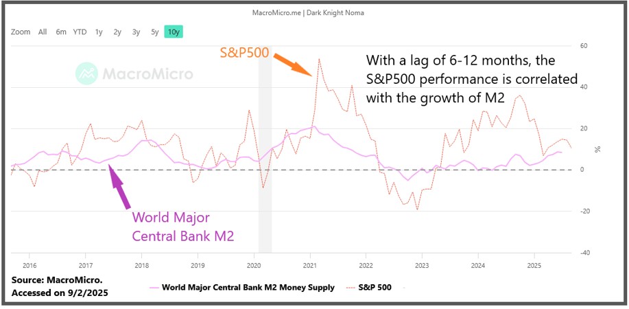
M2 AND SP500 PERFORMANCE 2

Illustration 1: Source https://en.macromicro.me/charts/101057/Major-Central-Bank-M2-Money-Supply-YoY-vs-S-amp-P-500-amp-NASDAQ-100-YoY  Accessed on 9/2/2025.

How does this astounding correlation between liquidity and stock market performance come about?

The key mechanism behind liquidity’s effect on valuations is its ability to alter risk perception.

Abundant liquidity acts as a cushion against systemic risk. Crashes and severe bear markets often emerge from liquidity traps or credit shortages, where even solvent entities cannot secure funding. These crises create downward spirals, forcing investors to demand steep risk premiums. In contrast, liquidity-rich environments do the opposite:

  1. They reduce systemic risk fears. Investors recognize that abundant liquidity minimizes the likelihood of financial meltdowns, thereby lowering the perceived risk of holding equities and other risk assets.
  2. They compress volatility expectations. High liquidity levels reduce the probability of market dislocations. Lower expected volatility drives higher valuations because investors are willing to pay more for future cash flows when risks feel manageable.
  3. They improve market functioning. Deep liquidity allows distressed assets to be absorbed quickly, reducing contagion risk. This stability encourages long-term investors to remain fully invested, adding further upward pressure on prices.
  4. They encourage a search for yield. With abundant liquidity and low interest rates, investors shift from cash or bonds into equities, boosting demand and driving multiples higher.

This is why liquidity expansions have an asymmetric effect: they push valuations higher much faster than they push GDP or earnings. They change investor psychology and pricing models, making equities and other risk assets appear safer relative to their historical risk profile.

The chart below plots M2 (x-axis top) vs. the PER (y-axis). We observe that M2 tends to grow exponentially as every doubling of M2 occurs in less time. The linear regression shows that the higher M2, the higher the PER.
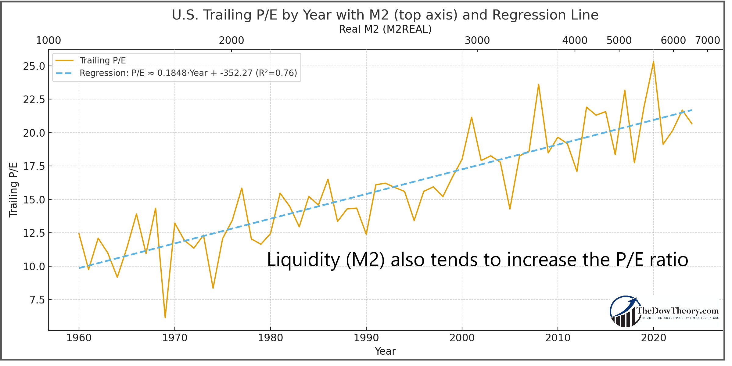
trailing PER and M2 edited

 Illustration 2: Correlation M2 and the S&P500 performance.

And what happens to the stock market when liquidity increases so much that its annual growth rate exceeds that of the real GDP?

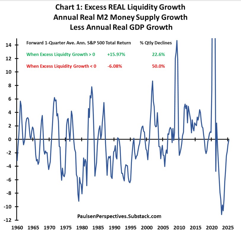
When the U.S. M2 annual growth exceeds annual real GDP growth, equities deliver much stronger returns. When GDP growth outpaces M2 growth, the stock S&P500 stagnates or declines. This shows that liquidity does not merely raise nominal stock market earnings or GDP; it reshapes the market’s willingness to pay for those earnings.

Jim Paulsen’s research captures this dynamic as he shows in this chart:
Paulsen Chart liquidity

Illustration 3: Correlation between excess liquidity and the S&P500 performance.

I quote Jim Paulsen:

“[s]ince 1960, for all quarters when real excess annual liquidity growth was positive, the forward 1-quarter average annualized S&P 500 total return was a robust 15.97% compared to a forward 1-quarter average annualized S&P 500 loss of -6.08% for quarters when real excess liquidity was negative. Moreover, during quarters when excess liquidity was negative, the S&P 500 index suffered forward 1-quarter total return losses nearly 50% of the time compared to only 22.6% of the time when real excess liquidity was positive.”

As an aside, as of this writing (early September 2025), Jim Paulsen’s observation is bullish for the US stock market.

Historical Perspective: Liquidity Traps and Crashes

Market history shows that major financial crises, such as the Great Depression, the 2008 Global Financial Crisis, and the 2020 COVID-19 crash, were triggered or amplified by liquidity shortages. When liquidity dries up, credit channels seize, systemic risk skyrockets, and investors demand steep discounts for risk assets.

Conversely, periods of abundant liquidity not only support valuations but also act as a stabilizing force. In the post-2008 era, unprecedented central bank liquidity injections not only prevented systemic collapse but also ushered in a decade-long bull market. This underscores that liquidity doesn’t just follow market cycles; it shapes them.

But there’s a catch. Markets can become “hooked” on easy liquidity, making them vulnerable to sharp pullbacks if it suddenly dries up. That’s why timing indicators matter: they help us ride the wave when liquidity flows freely and protect us when the tide turns.

Rising Capital per Capita and the Decline in Natural Rates

While abundant liquidity helps push higher values, another crucial factor is the growth of capital per person.

As economies become wealthier, capital becomes more plentiful, leading to lower natural interest rates. By “natural” interest rate, I mean the interest rate free of inflation that would typically prevail in a given economy without central bank interference. The Austrian School of Economics has excellent insights into the natural rate of interest.

Interest is the cost of capital. If capital is scarce, the natural interest rate will rise. If it becomes abundant, like the price of everything, its rate will decline. This is why wealthy countries have lower interest rates than poorer countries. Lower interest rates result in higher valuations for stocks (PER).

A proxy for the capital stock per capita is GDP per capita, which I will use for the rest of this article.

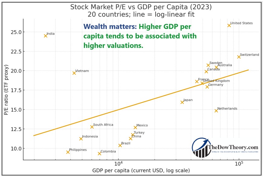
I created the chart below that shows the relationship between GDP per capita and PER. I used the ETF representing each country as a proxy for its stock market. The x-axis displays GDP per capita, and the y-axis displays PER. The linear regression line clearly indicates that the higher the country’s GDP per capita, the higher the PER.

The correlation between a country’s wealth and its PER is noteworthy:
GDP AND CAPE EDITED 2

Illustration 4: Correlation Between Wealth per Capita in several countries and Valuation Multiples

The chart above has a Pearson correlation coefficient of 0.64, which is high, implying that a 2x richer country tends to have a 1.4 P/E points higher valuation (based on the fitted slope).

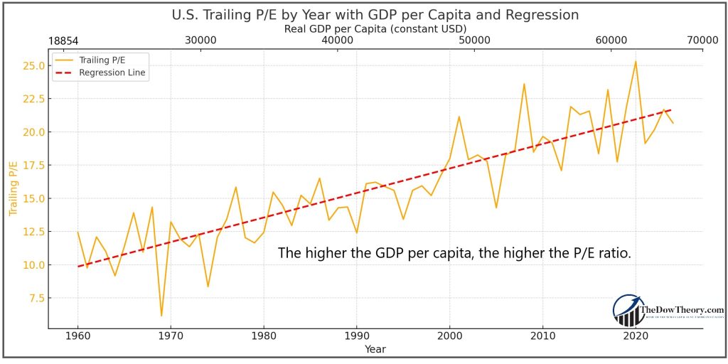
But things get even more interesting when we focus on the USA. The USA has continually grown richer in inflation-adjusted terms, which means a higher real GDP per capita.
GDP and PER edited

Illustration 5: Correlation Between US inflation-adjusted GDP per Capita and Valuation Multiples

Higher capital, measured by GDP per capita, also contributes to higher valuations in the USA. GDP inflation-adjusted has risen from the 1960s to today, as has the PER.

A lower natural interest rate resulting from increasing GDP directly boosts valuation multiples: when future earnings are discounted at a lower rate, their present value rises. Comparing current valuation levels to those of the 1970s or 1980s ignores this structural change. In a world with abundant capital, it is rational—not speculative—for investors to pay higher prices for each unit of earnings.

How much of the PER expansion is due to liquidity and how much to growing GDP per capita?

So far, we have examined how both liquidity and rising GDP per capita influence stock market valuations. An attentive reader might wonder whether we are conflating these two variables, as both affect the price-to-earnings (P/E) ratio. It is essential to separate and isolate the impact of each factor on P/E expansion.

Using AI, I conducted an in-depth analysis to separate the effects of liquidity growth from those of increasing GDP per capita. How much has each factor contributed to expanding PERs?

Since 1960, there has been a rise in the trailing P/E of about +12.7 points in total.

  • Of that, roughly +4.1 points came from GDP per capita growth.
  • Roughly +8.6 points came from more liquidity (real M2).

Therefore, for Trailing P/E, liquidity accounts for about twice as much of the increase as GDP does, but both are important.

Roughly, an increase of +1% in GDP per capita results in an increase of about +0.032 PER points.

And an increase of +1% in real M2 brings about a rise of +0.046 PER points.

Conclusion: Implications for Investors.

For investors, this analysis changes how valuations should be read. High P/E ratios or market cap to GDP levels are not automatic warning signs. They reflect powerful forces: abundant liquidity, low natural interest rates, reduced systemic risk, and a growing capital base. Valuations must be measured against these realities rather than clinging to outdated rules that label a P/E of 10 as cheap and 22 as expensive.

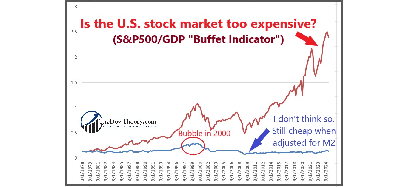
In this vein, just as a P/E ratio of 22 is often seen as expensive, many investors claim that another indicator points to extreme overvaluation: the Buffett Indicator, which compares the total stock market value to the country’s GDP. At first glance, its current reading (red line in the chart) appears extreme and seems to confirm that a crash is inevitable. That conclusion is wrong. Adjusting the Buffett Indicator for M2 gives a very different picture. The blue line at the bottom of the chart shows the ratio has hardly moved, from 0.13 in 1978 to 0.14 today.

During the dotcom bubble, the liquidity-adjusted indicator reached 0.296 in March 2000, more than twice today’s level. Seen through the lens of liquidity, current valuations are elevated but nowhere near the excesses of that era.
 

Buffet Indicator adjusted 3

In today’s global economy—wealthier, more liquid, and better-capitalized than at any time in history—high valuations are not signs of irrational exuberance but reflections of structural forces that have permanently shifted the baseline for pricing risk.

However, should liquidity suddenly contract and/or GDP per capita shrink (due to misguided economic policies, war, etc.), then we should brace ourselves for a market crash, which is precisely what happened in the 1930s depression: Shrinking liquidity and real GDP. Market timing will be the lifeboat in such a case.

Sincerely,

Manuel Blay

Editor of thedowtheory.com


Monday, August 25, 2025

Unlocking the Power of Market Timing

 Featured in Technically Speaking (August 2025) and spotlighted by Investopedia, this article delivers hard evidence for smarter investing, proving how disciplined timing can cut drawdowns and drive lasting success.

 “The Power of Market Timing” is an essential read for anyone serious about achieving lasting financial success. Featured in the August 2025 issue of Technically Speaking, it offers conclusive evidence that market timing is critical for long-term survival. The data challenges the traditional buy-and-hold approach and makes a compelling case for adopting strategies that cut drawdowns and outperform.

https://tinyurl.com/mrwy3w54

A heartfelt thank you to CMT Association Editor Alayna Scott and Curriculum Director Louis Spector for showcasing my work.

Sincerely,

Manuel Blay

Editor of thedowtheory.com
Tuesday, July 29, 2025

When fundamental Indicators Break Down, Price Still Leads


The LEI and yield curve missed the mark. Price action and margin debt told the real story, and we listened


 For decades, investors leaned heavily on two stalwart indicators: the yield curve and the Leading Economic Index (LEI). These tools had an almost mythic reputation for signaling recessions and bear markets.

However, as Jim Paulsen recently pointed out in his piece Broken Relationships, both once-reliable guides have lost their mojo.

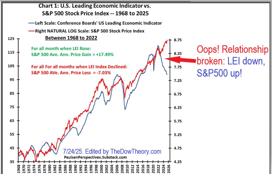
The LEI, a composite of ten economic indicators, including the yield curve and consumer sentiment, has historically done a remarkable job warning of recessions and, by extension, bear markets. Whenever LEI momentum turned negative, stocks usually followed suit. That pattern held for over 60 years.

Until it didn’t.

As Paulsen notes, the LEI correctly signaled the 2022 bear market. But then something broke. While the S&P 500 bottomed in October 2022 and entered a new bull market, the LEI continued to decline, as shown in the chart below.

broken relationships Edited

That’s unprecedented. The result? Many investors missed out, trapped in recessionary narratives despite clear upward price action.

The other broken relationship Paulsen highlights is bond vigilantism. For years, market watchers feared that rising government deficits would push bond yields higher. That relationship, too, has unraveled. Since the mid-1990s, higher deficits have often been accompanied by lower real bond yields. The vigilantes, if they ever existed, are now ghosts, although I suspect they are about to make a comeback.

As with the LEI, we did not fall prey to the ominous message displayed by a persistent inverted yield curve that lasted more than one year and accompanied the birth of the October 2022 bull market.

What does this mean for us?

It means we must respect history, but we should never become enslaved to it.

At TheDowTheory.com, we’ve monitored the LEI and yield curve throughout 2022, 2023, and 2024. We acknowledged their warnings, but we didn’t fall prey to them. We followed the trend. We followed price action. And it paid off.

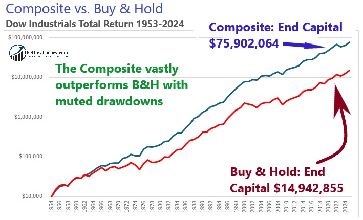
Our equity curve says it all:

01 graph COMPOSITE VS BUY HOLD year ended 2024

Here’s the simple truth: price action trumps everything.

If the market is in a bull phase, you act accordingly. You don’t wait for every economic signal to align.

You invest first and ask questions later. That’s not recklessness, that’s responsiveness.

Another indicator we’ve placed consistent trust in and which continues to deliver is margin debt. Unlike surveys or lagging macro data, margin debt reflects real conviction. When investors borrow to increase exposure, it signals bullish sentiment backed by capital. And margin debt trends—especially when rising in tandem with the market—are rarely wrong. Margin investors tend to be more sophisticated, and their actions offer insight that many overlook.

Subscribers to TheDowTheory.com have seen this in real-time. While others fretted over broken indicators, we tracked margin debt trends, watched price action, and remained focused. The result? We did not miss the Bull market that started in October 2022, nor did we miss the one that began on April 8th, 2025.

This is not to say we ignore classic indicators. We keep them on the radar. But when push comes to shove, the final arbiter is the market itself. Fundamentally-based indicators come and go. Narratives break. However, price action is always right.

Sincerely,

Manuel Blay

Editor of thedowtheory.com
 

Monday, July 7, 2025

Two new interviews with Alessio Rastani on Youtube


Once again, I was invited by Alessio Rastani to join him in two new videos.

Since I was in my 80% work, 20% vacation mission across Europe, I was not fully equipped, so we had to do an “unplugged” performance. No fancy mic, nor headphones or hi-end speakers on my end. Just my reliable laptop, and the Real Madrid F.C. t-shirt I was wearing at the moment.

We recorded both videos on July 4th.

In the first video, we said that a pullback was looming on the near-term horizon, and I explained why. Spot on!

I also explained that I remain long-term bullish.

https://www.youtube.com/watch?v=qPMQ6SX4BMo&t=786s


The second video focuses on Bitcoin and the influence of Ethereum in generating signals for Bitcoin. The principle of confirmation works.

https://www.youtube.com/watch?v=GGsp6VNkT_g


 Sincerely,

Manuel Blay

Editor of thedowtheory.com


Saturday, June 14, 2025

The Real Problem with Buy & Hold—and What to Do About It


Three Smarter Ways to Cut Drawdowns Without Killing Performance

The core issue with buy-and-hold investing is simple: drawdowns. Big ones. They may be inevitable, but that doesn’t make them any less damaging—both financially and psychologically.

To address this, many investors turn to buffered ETFs, hedging with puts, or going short. But there’s a catch: these protective strategies come at a steep price. They can sap performance, require precise execution, and often fail to provide consistent results when you need them most. In short, they cost money—and they typically dilute returns.

Another response is to do… nothing. Just “weather the storm.” After all, markets always recover—right? That’s the theory. But in practice, this approach falters for two big reasons:

  1. Most investors drastically overestimate their tolerance for drawdowns. It’s easy to say, “I can handle a 50% drawdown”—until it actually happens. In real life, drawdowns don’t just hurt portfolios—they wreck confidence and cause people to bail out at the worst possible moment.
  2. The U.S. market is the exception, not the rule. Historically, the S&P 500 has shown an incredible ability to bounce back from deep losses and hit new highs. But many global markets haven’t. European indices, for example, have gone decades without recovering prior peaks. And who’s to say the U.S. will remain exceptional forever?

So what are investors left with?

You can either:
✅ Weather the storm and risk getting crushed by a massive drawdown,
or
✅ Hedge and accept the long-term performance drag that comes with it.

Neither option is ideal.

That’s why I believe in a third path—one that sidesteps both the psychological toll of deep drawdowns and the performance drag of costly hedging. It’s built on three key pillars:

🔹 Market Timing

When properly executed, market timing is one of the very few strategies that can reduce drawdowns without incurring the costs of hedging—and often with the added benefit of outperformance. While it’s often dismissed, the reality is that trend-following and timing approaches, when grounded in data, are both cost-efficient and effective. My Composite Timing Indicator is a key example of such an approach.

The chart belows show the outperformance and marked drawdown reduction of the Composite:

01 graph COMPOSITE VS BUY HOLD year ended 2024

🔹 Sector Rotation

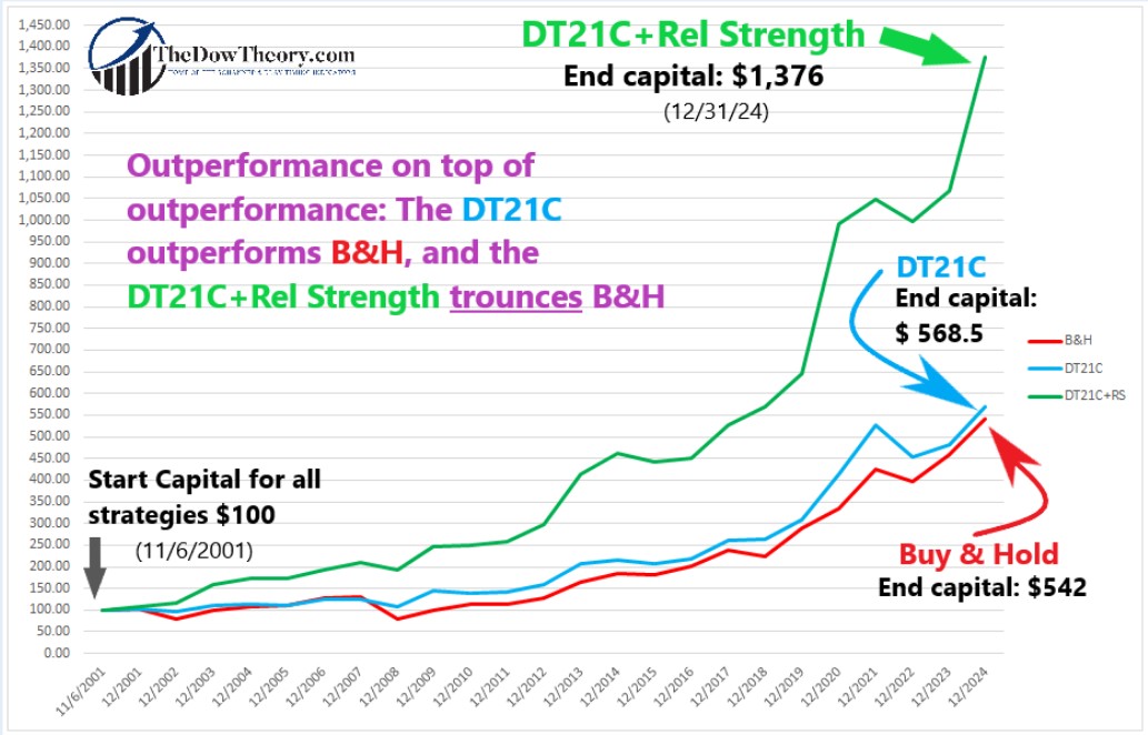
By dynamically shifting exposure across asset classes or market sectors, investors can sidestep underperforming areas and adapt to changing macro conditions. It adds another layer of diversification that helps absorb shocks without relying on expensive hedges. My Dow Theory + High Relative Strength strategy harnesses this principle by combining market timing with exposure to leading sectors.

dow theory relative strength

🔹 Quantitative Stock Selection

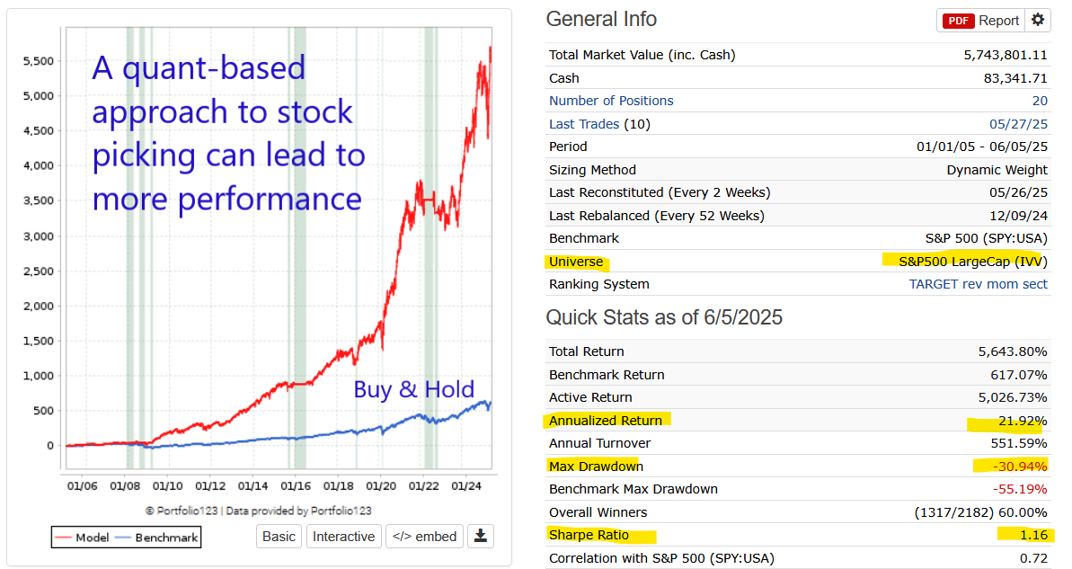
Finally, stock picking doesn’t have to be guesswork. Using a quantitative approach to select stocks with a proven statistical edge enhances the overall resilience and return potential of the portfolio—especially when combined with timing and sector rotation. Portfolio 123 is the tool to build a systematic stock selection process that filters out obvious “lemons” and tilts toward winners.

This is an example of what can be achieved with a good stock picking strategy:

Quant based approach

No strategy is perfect, but combining these three elements can provide a robust framework to reduce drawdowns, sidestep prolonged underperformance, and—most importantly—keep you in the game.

Because the real risk isn’t just losing money.
It’s losing the discipline to stay invested when it matters most.

Sincerely,

Manuel Blay

Editor of thedowtheory.com

Tuesday, June 10, 2025

Bull market for the gold and silver miners ETFs (GDX & SIL) signaled on 6/2/25


Overview: The precious metals landscape has turned very bullish. Gold, silver, platinum, and even base metals like copper are trending strongly upward. GDX and SIL are no exception to this new trend.

General Remarks:

In this post, I provide an in-depth explanation of the rationale behind employing two alternative definitions to evaluate secondary reactions.

SIL refers to the Silver Miners ETF. More information about SIL can be found HERE.

GDX refers to the Gold Miners ETF. More information about GDX can be found HERE.

A) Market situation if one appraises secondary reactions not bound by the three weeks and 1/3 retracement dogma.  

As I explained in this post, the trend was signaled as bearish on 12/18/24.

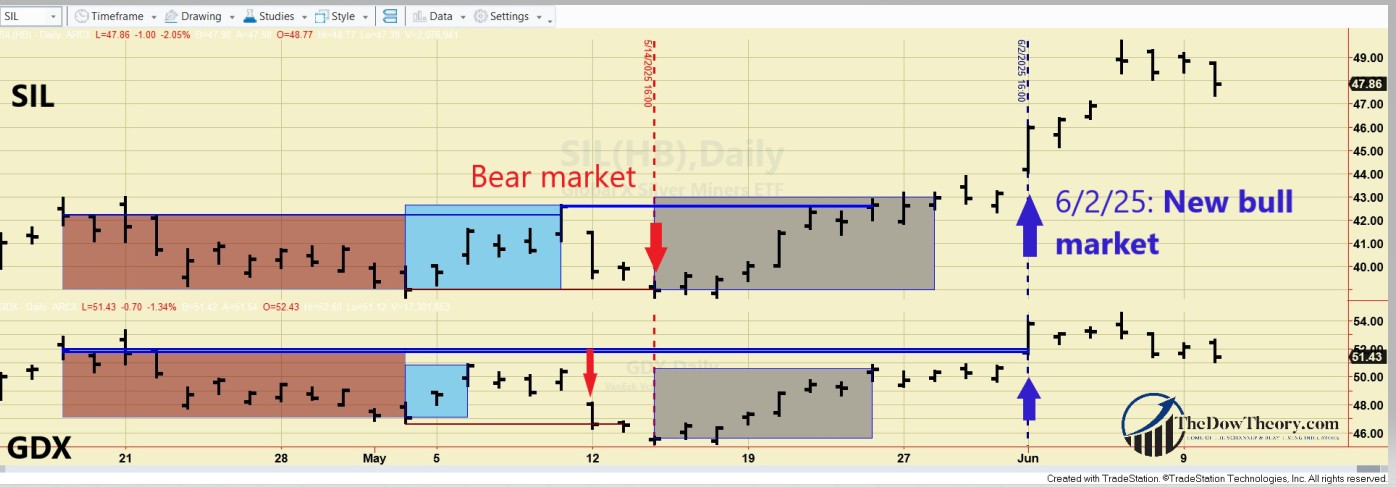
In a clear case of whipsaw, no sooner had the bear signal been triggered than GDX and SIL staged strong rallies, breaking above their previous bull market highs (5/9/25 for SIL at 42.57 and 4/16/25 at 51.91 for GDX). This confirmed breakout occurred on 6/2/25 and shifted the trend to bullish.

The chart below displays the most recent price action. The brown rectangles show the last secondary reaction. The blue rectangles display the rally that set up both ETFs for a primary bear market signal. The red horizontal lines highlight the secondary reaction lows, whose breakdown signaled the end of a primary bear market, and the blue horizontal lines indicate the last recorded primary bull market highs, whose breakup signaled a new primary bull market. The grey rectangles show a bounce that did not meet the time requirement to qualify as a secondary reaction.

307 gdx sil bull market EDITED

So, the primary and secondary trends are bullish.

B) Market situation if one sticks to the traditional interpretation demanding more than three weeks and 1/3 confirmed retracement to declare a secondary reaction.

As I explained in this post, the primary trend was signaled bullish on 3/13/25.

The most recent current drop did not last at least 15 trading days on both ETFs, so there was no secondary reaction, and hence, no change of trend.

Higher confirmed highs have reconfirmed the primary bull market.

Therefore, the primary and secondary trends remain bullish.

Recent price action underscores the importance of analyzing the trend using two alternative time frames. The shorter-term time frame was whipsawed, while the longer-term time frame remained bullish throughout.

Sincerely,

Manuel Blay

Editor of thedowtheory.com


Monday, June 9, 2025

Gold and Silver in Sync: The Bull Marches On


Silver Seals the Deal: Bull Market Reconfirmed 

Overview: On 6/5/25, silver broke above its 10/22/24 highs. It confirmed gold’s previous breakup on 1/30/25. Accordingly, the primary bull market has been confirmed.

By the way, the recent price action of SLV and GLD offers a powerful reminder of how the principle of confirmation can protect you from costly mistakes. If we had focused on SLV alone, we might have been fooled into thinking a new bear market was underway—it was just a fakeout. This post (and the links within) walks you through several real-world examples showing how confirmation helps filter out false signals and adds real value to your trading decisions.

General Remarks:

In this post, I extensively elaborate on the rationale behind employing two alternative definitions to evaluate secondary reactions.

GLD refers to the SPDR® Gold Shares (NYSEArca: GLD®). More information about GLD can be found HERE.

SLV refers to the iShares SLVver Trust (NYSEArca: SLV®). More information about SLV can be found HERE

A) Market situation if one appraises secondary reactions not bound by the three weeks and 1/3 retracement dogma.  

As I explained in this post, the primary trend was signaled as bullish on 4/3/24.

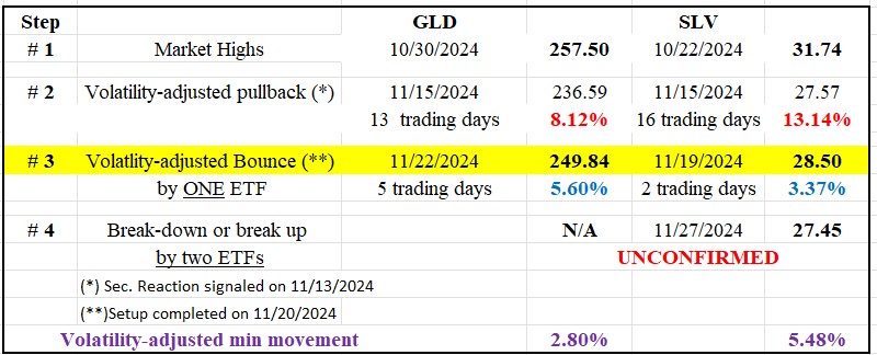
Following the 10/22/24 (SLV) and 10/30/24 (GLD) highs (Step #1 in the table below), there was a pullback until 11/15/24 (Step #2). Such a pullback meets the time and extent requirement for a secondary (bearish) reaction against the still-existing primary bull market. You may find a more in-depth explanation here.

A two-day bounce followed in SLV until 11/19/24, and in GLD until 11/22/24 (Step #3). This bounce met the time (≥2 confirmed days) and extent requirements to set up both precious metals for a potential primary bear market signal.

On 11/27/24, SLV pierced its 11/14/24 lows—unconfirmed by GLD (Step #4). The lack of confirmation meant that no primary bear market was signaled.

The table below displays the price action:


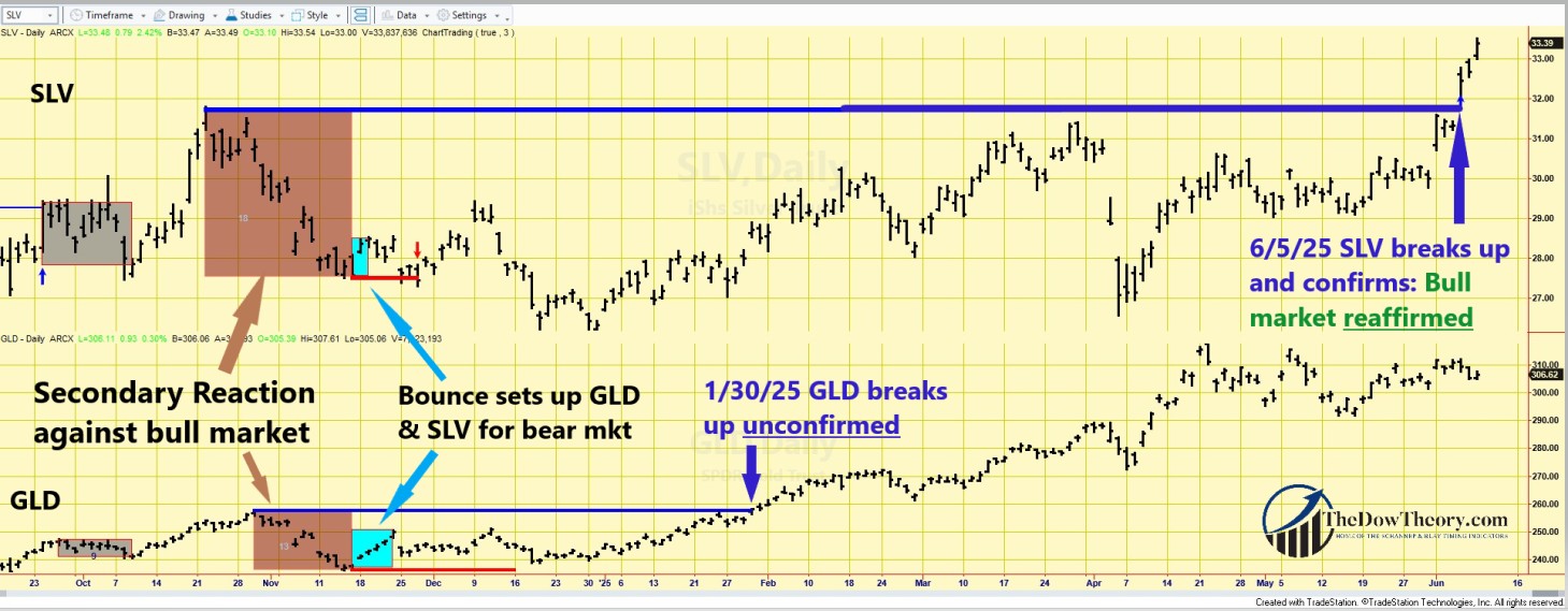
On 1/30/25, GLD surpassed its 10/30/24 highs, unconfirmed by SLV. This lack of confirmation meant that the bull market had not yet been reconfirmed, and the setup for a potential bear market signal remained in force. On 6/5/25, SLV finally surpassed its 10/22/24 highs, confirming GLD’s breakout.

Therefore, the current situation is as follows:
a) The primary bull market has been reconfirmed.
b) The setup for a potential bear market has been canceled.
c) The secondary (bearish) reaction against the bull market has been terminated.

The chart below highlights the price action.

  • The brown rectangles show the secondary reaction against the bull market.
  • The blue rectangles indicate the bounce that set up GLD and SLV for a potential primary bear market signal.
  • The red horizontal lines highlight the secondary reaction lows whose confirmed breakdown would have signaled a new bear market.
  • The blue horizontal lines underline the bull market highs, whose breakout confirms the ongoing bull market.

3065 GLD SLV DOW THEORY chart EDITED

So, the primary and secondary trends are now bullish.

B) Market situation if one sticks to the traditional interpretation demanding more than three weeks and 1/3 confirmed retracement to declare a secondary reaction.

I explained in this post that the primary trend was signaled as bullish on 4/2/24.

The current pullback did not reach 15 confirmed days by both ETFs, so there is no secondary reaction against the bull market.

So, the primary and secondary trends are bullish under the “slower” appraisal of the Dow Theory.

Sincerely,

Manuel Blay

Editor of thedowtheory.com


Saturday, May 31, 2025

Critical Juncture for Bonds: Bear Market Signal One Step Away

Set up for a potential bear market signal for TLT and IEF completed on 5/30/25

Overview: the most recent rally within an extended secondary (bearish) reaction has set up TLT and IEF for a potential primary bear market signal. The trend remains bullish to this day, but if the key prices I show in this post are jointly pierced, a new bearish trend will be signaled.

General Remarks:

In this post, I provide an in-depth explanation of the rationale behind employing two alternative definitions to evaluate secondary reactions.

TLT refers to the iShares 20+ Year Treasury Bond ETF. You can find more information about it here.

IEF refers to the iShares 7-10 Year Treasury Bond ETF. You can find more information about it here.

TLT tracks longer-term US bonds, while IEF tracks intermediate-term US bonds. A bull market in bonds signifies lower interest rates, whereas a bear market in bonds indicates higher interest rates.

A) Market situation if one appraises secondary reactions not bound by the three weeks and 1/3 retracement dogma 

As I explained in this post, the primary trend shifted to bullish on 4/4/25.

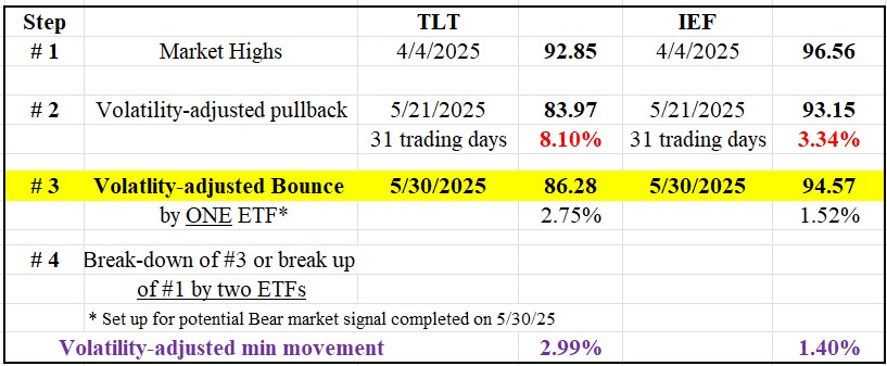
Following the highs on 4/4/25, there was a substantial pullback until 5/21/25 for both TLT and IEF. This pullback thoroughly met the time and extent requirements for a secondary reaction.

On 5/21/25, TLT violated its 1/14/25 lows unconfirmed by IEF, so no primary bear market was signaled. Thus, the primary bull market remained intact. The lows of 1/14/25 are the lows of the previous bear market. The lows of the last bear market also serve as relevant price levels to signal a trend change when we don’t have another option at a higher price level.

A rally ensued after the 5/21/25 lows (Step #3), which lasted for >=2 days with IEF exceeding its VAMM. Please remember that we don’t require confirmation for the final rally that completes a bear (or bull) signal setup. More information is in this post.

The table below gives you the relevant dates and prices:

Table bond prices

So, now the situation is as follows:

  1.  A primary bear market will be signaled if TLT and IEF jointly pierce their 5/21/25 (TLT, at 83.97) and 11/6/24 (IEF, at 93.15) closing lows (Step #2 in the above table).
  2. The primary bull market will be reconfirmed, and the setup for a potential bear market signal canceled, if TLT and IEF jointly surpass their 4/4/25 closing highs (Step #1).

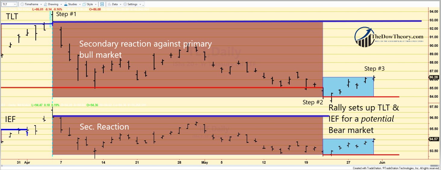
The following charts depict the latest price movements. Brown rectangles indicate the secondary (bearish) reaction opposing the ongoing primary bull market. Blue rectangles highlight the recent rally that fulfilled the setup for a potential primary bear market (Step #3). Red horizontal lines mark the secondary reaction lows (Step #2), while blue horizontal lines show the primary bull market peaks. A breach of these peaks would reaffirm the primary bull market, though this scenario appears unlikely in the near term.

TLT IEF EDITED

Therefore, the primary trend is bullish, and the secondary trend is bearish.

B) Market situation if one sticks to the traditional interpretation demanding more than three weeks and 1/3 confirmed retracement to declare a secondary reaction.

As I explained in this post, the primary trend shifted to bullish on 4/4/25.

The most recent pullback meets the time (>=15 trading days) and extent requirement for a secondary reaction. And the most recent rally has also set up TLT and IEF for a potential primary bear market signal.

In this instance, the long-term application of the Dow Theory aligns with the shorter-term version, resulting in a secondary reaction against the primary bull market. The most recent rally has set up both ETFs for a potential primary bear market signal.

Sincerely,

Manuel Blay

Editor of thedowtheory.com


Thursday, May 15, 2025

Dow Theory signal: Bear Market for Gold and Silver Miners triggered on 5/14/25


Overview: The easing of geopolitical tensions, a preliminary truce in the tariff wars, and some forced liquidations have pushed GDX and SIL into a new bear market. In contrast, gold and silver have remained more resilient and continue to trade within a primary bull market.

General Remarks:

In this post, I extensively elaborate on the rationale behind employing two alternative definitions to evaluate secondary reactions.

SIL refers to the Silver Miners ETF. More information about SIL can be found HERE.

GDX refers to the Gold Miners ETF. More information about GDX can be found HERE.

A) Market situation if one appraises secondary reactions not bound by the three weeks and 1/3 retracement dogma.

As I explained in this post, the primary trend was signaled bullish on 3/13/25.

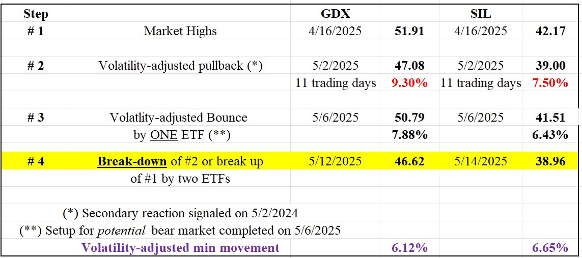
Following the 4/16/25 closing highs (Step #1 in the table below), GDX and SIL dropped for 11 trading days (Step #2). The time requirement for a secondary reaction was met. The pullback exceeded the Volatility-Adjusted Minimum Movement (VAMM), so the extent requirement was also fulfilled. More about the VAMM HERE.

A rally followed (Step #3) that was >=2 days on both ETFs, with GDX exceeding its VAMM. Please remember that we don’t require confirmation for the final rally that completes a bear (or bull) signal setup. More information is in this post.

On 5/14/25 (Step #3), GDX and SIL jointly pierced their respective secondary reaction lows, as shown in Step #2 in the table below. Such a confirmed breakdown shifted the trend from bullish to bearish.

GDX SIL BEARISH TABLE MAY 15 2025

So, the primary and secondary trends are bearish now.

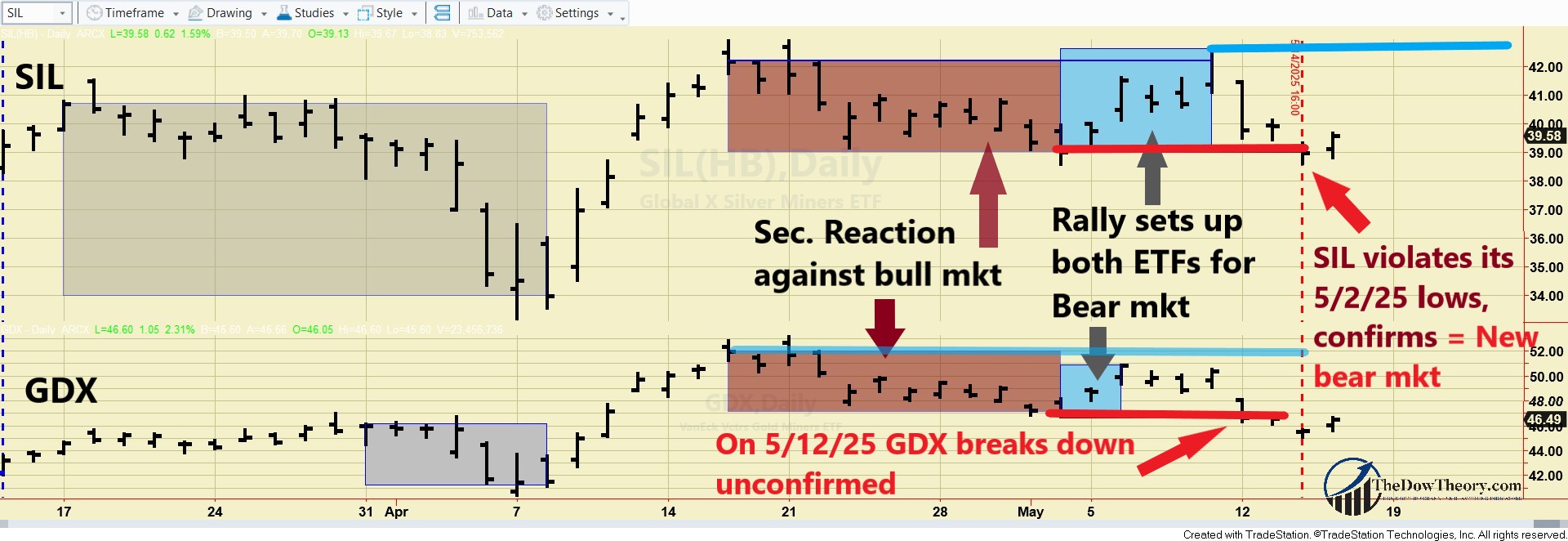
The following charts depict the latest price movements. Brown rectangles indicate the secondary (bearish) reaction opposing the ongoing primary bull market. Blue rectangles highlight the recent rally that fulfilled the setup for a potential primary bear market (Step #3). Red horizontal lines mark the secondary reaction lows (Step #2). The blue horizontal lines show the bull market highs. A breach of these peaks would signal a new primary bull market, though this scenario appears unlikely in the near term. The grey rectangles highlight a pullback that did not meet the time requirement for a secondary reaction, and hence was ignored.

GDX SIL BEARISH CHART MAY 15 2025 edited

So, the situation is as follows: At the current juncture, a breakup on a closing basis by GDX of the 4/16/25 closing highs and by SIL of the 5/9/25 closing highs would signal a new bull market. Until this breakup occurs, we consider GDX and SIL in a bear market.B) Market situation if one sticks to the traditional interpretation demanding more than three weeks and 1/3 confirmed retracement to declare a secondary reaction.

As I explained in this post, the primary trend was signaled bullish on 3/13/25.

The current drop has not reached at least 15 trading days on both ETFs, so there is no secondary reaction.

Therefore, the primary and secondary trends remain bullish.

Sincerely,

Manuel Blay

Editor of thedowtheory.com